Showcase Your Products Like a Pro: Flexible Image Layouts with ShopMaker
Overview
When it comes to online shopping, first impressions matter. The way you present your product images can directly impact user engagement and conversion rates. ShopMaker gives you full control over how your product images are displayed in the product detail page with several powerful layout options — including some creative PRO layouts — to make your products shine across all devices.
Why Image Layout Flexibility Matters
Standard WooCommerce themes usually display the main product image with small thumbnails underneath. While functional, this layout doesn’t always do justice to your product images, especially when viewed on mobile devices. With ShopMaker, you get multiple layout options that adapt to different image formats and user needs, delivering a modern and professional experience that stands out.
Available Product Image Layouts
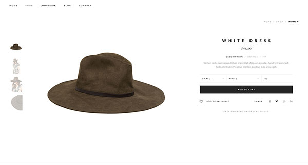
1. Thumbnails Bottom (Free)
Best for: Traditional, familiar layout
Description: Similar to the default WooCommerce gallery. The main product image is displayed on top, while additional thumbnails appear beneath. Clicking a thumbnail replaces the main image.
When to use: Ideal for simple shops or when you want to keep things clean and familiar, especially if you’re transitioning from a classic WooCommerce setup.
PRODUCT IMAGE - THUMBNAILS BOTTOM - SHOP MAKER
PRODUCT IMAGE - THUMBNAILS LEFT - SHOP MAKER
2. Thumbnails Left (PRO)
Best for: Quick thumbnail access, modern layout
Description: Works just like Thumbnails Bottom, but the thumbnails are placed vertically to the left of the main image. This gives more vertical space for your product and improves browsing on both desktop and tablet.
When to use: Great if you want a fresh, more polished look with easier navigation between images. A professional touch that instantly makes your product page feel more high-end.
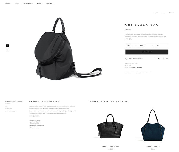
3. Slider (PRO)
Best for: Wide or square images, transparent PNGs
Description: Displays all product images in a horizontal slider. Navigation can be styled with arrows or text, and positioned and colored to match your brand.
When to use: Perfect for stylish, modern products like sunglasses, headphones, backpacks, or any items that look great with wide or square images. Especially effective for visuals with transparent backgrounds (PNG), giving your product a clean and premium look.
PRODUCT IMAGE - SLIDER - SHOP MAKER
PRODUCT IMAGE - SLIDER - SHOP MAKER
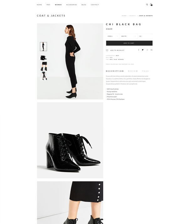
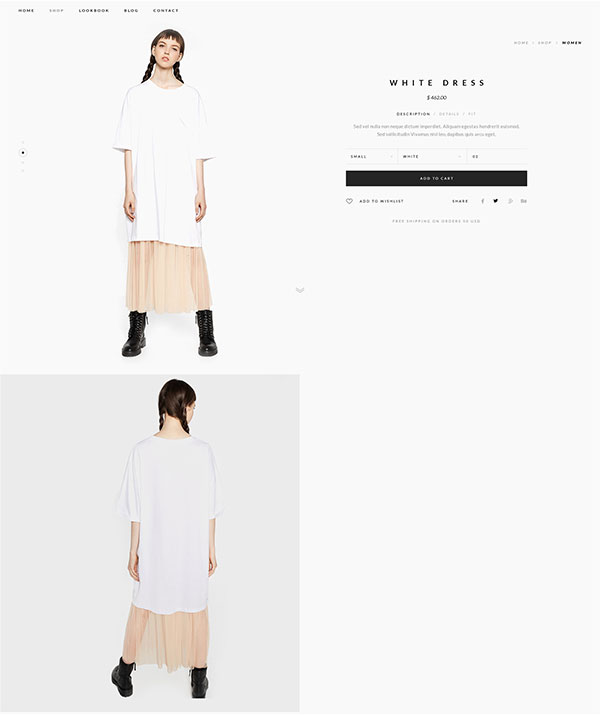
4. Navigation (PRO)
Best for: Tall/portrait images, immersive visual layouts
Description: Thumbnails are shown vertically on the left, always accessible, while full-size images appear below and take up the full width of the content area. Clicking a thumbnail scrolls the page to the corresponding large image.
When to use: Excellent for storytelling through imagery — ideal for fashion (dresses, outfits), posters, photography gear, or any product that benefits from tall, immersive visuals. Gives a creative and premium vibe that sets your store apart.
Choosing the right layout isn’t just about style — it’s about functionality, device compatibility, and how your products visually communicate their value. Here are a few helpful pointers:
Slider: Best for wide or square product images, especially PNGs with transparent backgrounds. Creates a modern, clean presentation that makes products “pop.” Ideal for fashion accessories, tech items like headphones, or any product that benefits from high visual impact.
Navigation: Excellent for portrait-oriented images or product storytelling. Adds a high-end, editorial feel. Especially useful for apparel, wall art, and other vertically oriented visuals.
Thumbnails Left: Offers a cleaner, more modern experience with fast image switching. Works well for most image types and is a great middle-ground layout.
Thumbnails Bottom: Simple and familiar. Best used if you’re sticking to WooCommerce defaults or have limited product images.
Remember, your image layout can directly influence how confident shoppers feel about your products — and ultimately, how likely they are to buy. Don’t be afraid to experiment and choose the layout that highlights your products best.
How to Change the Product Image Layout
Open your single product template in Elementor.
Select the Product Images widget (provided by ShopMaker).
In the widget settings, navigate to the Layout section.
Choose one of the available layout types: Thumbnails Bottom, Thumbnails Left, Slider, or Navigation.
Adjust style settings as needed to match your brand.
Save the template and preview it on your live site.
Explore how each layout works with your images and don’t forget — you can always save different templates for different types of products depending on what works best.